
Any tricks making it more nice looking and legit? Sorry I don't have Photoshop.

Posts: 342
Status: Offline Group: Member Member: #42 |
Sep 1st, 2012 @ 3:05 am Perma-link
I'm horrible outlining and add coloring from sketches. I did this with Fireworks MX 2004:
Any tricks making it more nice looking and legit? Sorry I don't have Photoshop.
|
|
poutine god

Posts: 459
Status: Offline Group: Member Member: #6 |
Sep 1st, 2012 @ 12:52 pm Perma-link
Hey, lack of Photoshop isn't a big deal.
NOTE: This is entirely my opinion, and you may find good results using other techniques, I'm not really that good. First, make sure you are happy with your sketch. It helps to draw it lightly, because then you can erase it easier and no marks will show up after. Now, lining it out digitally is rather tricky to do without a tablet, and if you do have one you may as well do the entire thing digitally. The line width remains uniform throughout, which makes it look flat and lifeless. IF you have a tablet, you can alter the pressure of your strokes, but if you don't I suggest lining it out manually. A little cheat is this: the thicker the line width, the easier it is for dumb scribbles to actually look presentable. (If you've ever seen my old Korby comic...) You could use a Sharpie, but those tend to bleed a lot, and the ink is more purple than black. I don't know if they are sold in your country, but I used to use Pilot fineliners a lot. Those are really more for business than drawing, but they have a good, fine tip, a relatively long life, and the ink only bleeds sometimes (unfortunately, only when you really don't want it to...). I use a Japanese caligraphy pen, which is probably the most convenient thing I've ever used. It can draw thinner lines than any fineliner I know, and it can draw really thick ones. You could also use a brush and ink, but honestly if you're just going to be lining out doodles it's not worth it. Anyways, make sure your sketch is looking mostly the way you want it before inking. You can change things while inking, but if you do you can't just change it back like you can in pencil. So, let's say you have your sketch all Sharpied up now. Maybe it's a bit wobbly, but that's okay, it doesn't really matter since experience will make everything better. If you don't have a scanner, you can take a photo of it, but try to take the most well-lit, not-weirdly-angled photo that you've ever taken in your life. I'm going to use a random doodle of Kirby I did a little while back: 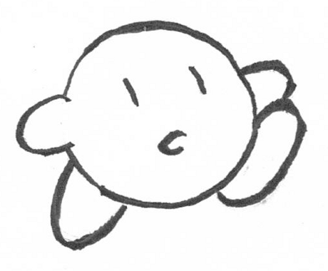 My scanner scans pretty lightly, so we are going to make it darker so the colours don't show through the lines. The program I use, GIMP, has brightness/contrast sliders, and I'm pretty sure most others do. By lowering the brightness and upping the contrast, we get this baby:  Okay, time to colour! But first, there needs to be a layer under the line art so you don't go over the lines and give the effect of a Grade 2 art class (unless you're going to do this fancy digital painting over it with no lines, but...). "Colour to alpha" is my best friend: 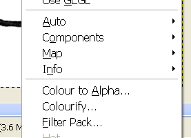 There should be that or an equivalent in your program. Anyways, click it, and change the colour white to alpha (transparent): 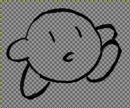 Checker Knight. If you are using basically anything besides MS Paint, you'll get layers. Open whatever you use to create layers in your program (please consult the enclosed instruction manual) and create a white one and a transparent one: 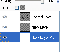 This is how mine looks. (The one that says "pasted layer" is the line art.) You can change the background colour with the fill tool, whatever, it doesn't actually matter since we are not going to be touching it in this case. One thing: do not use gradients! They make everything look really, really flat! You'll notice, if you look at Paper Mario 2 sprites for example, they use a gradient, however even that isn't just fill tool gradient. Honestly, to me blank colours look better than just a gradient. Let's fill in those blank colours to serve as a base! Pick your colours (it helps if they aren't burn-your-eyes-out bright) and select the 2nd layer, the completely transparent one. Then, just use the pen/pencil/brush tool and fill it in:  Look at that attractive young man. *cough* Now, we are going to shade! It really helps to do a bit of research on colour theory. But you remember hot and cold colours from primary school, right? Hot ones tend towards red, and cold ones tend towards blue. Mainly, cold colours are for shade and hot colours are for highlights. Anyways, I'm going to make a new layer above the base colours to shade on. You can do it on the same layer, but it makes it hard to correct later. Now, establish a light source: 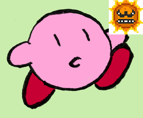 For this, it's going to be from the top right-hand corner. So, there are different techniques you can use to colour. I suggest looking into those. Study fan art you like, or classical paintings, and pay attention to how it's shaded, the colours they chose, etc. You should be able to set the opacity of your brush, but if you really like picking colours to blend with you don't have to. MS Paint in particular hates these fancy settings. Anyways, I chose a dark purple colour to be colder than the pink of Kirby's body, set my brush to a low opacity (20% and 13%) and shaded:  "It looks pretty crappy," you may think, and that's true, but we're not done yet! I'm going to choose a light colour redder than the pink and highlight. Take care to remember the light source, and the fact that whatever your drawing is a 3D object, so shade accordingly:  Yay. Kirby's brand of pink doesn't really like red that much, so fiddle about until you find a shade that works. Time for the shoes, choosing a different purple for shading and a brighter red for highlights:  Okay. Now clean up your workspace and wash your brushes, so to speak.  Here's the finished product. TL,DR: -Line width is important, it blesses the doodle with life -Gradients are not a fantastic choice for things that aren't graphic design -Keep a light source to base your shading on -hot and cold colours, shading with black is not the best idea, it sucks the life out of it Ermm, that's it for now. First time doing a tutorial... Didn't really plan that but the more I wrote it sort of became one. |
Never change your avatar
 
Posts: 3206
Status: Offline Group: Admin Member: #1 |
Sep 1st, 2012 @ 1:12 pm Perma-link
That's a good little art tutorial, actually! And Angry Suns make everything in life more exciting.
Also, I should make digital art more often...
Course clear! You got a card.
|

Posts: 196
Status: Offline Group: Member Member: #19 |
Sep 1st, 2012 @ 4:05 pm Perma-link
im always gonna be a fan of non-photoshop tutorials, good work
|

